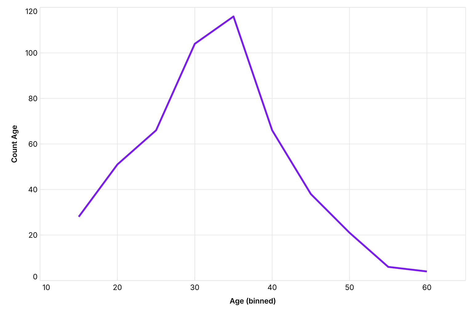
Statistics Chart
The Statistics chart shows the distribution of a numeric field. Data values are automatically grouped into bins, and the count of records in each bin is plotted as a line.
Mapping options
• X → Numeric field to bin into ranges.
• Y → Count (auto-calculated from the numeric field).
• Color → Dimension to split the distribution into multiple lines.
Tip
• Try adjusting bin size to see different levels of detail