Table
Tables excel at presenting precise data with clear row/column comparisons that anyone can interpret instantly.
They're versatile enough to show everything from detailed breakdowns to high-level summaries, making complex information accessible.
Adding in a table
There are two ways to add in a table:
- Toolbar -> Low-code -> select Table
- Select an existing cell and press '+' (add a cell) -> select Table
Formatting your table
- Customize easily by adding titles, drag columns into place, apply filters, and style to match your needs.
- Tables display up to 10,000 rows by default, but you can set custom limits or choose unlimited rows.
- Export as SQL, PNG, PDF, or CSV to distribute your data in any format and share seamlessly.

Table versus pivot table
Table Cell:
• Great for quickly visualising your data
• Easy sorting and filtering
• Can work with aggregated data from the SQL cell
• Good for exporting the CSV in the same format
• Great for summarising data
• Easy grouping across rows/columns
• Less flexible around sorting/filtering
• Cannot export pivots in their pivot format
Troubleshoot
Adding conditional formatting
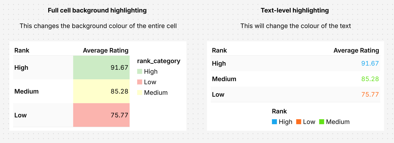
Count offers two ways to highlight table data:
1. Text-level highlighting – This will change the color of the text
2. Full cell background highlighting – This changes the background color of the entire cell
You can use SQL’s CASE statement to apply conditional logic and return values that can be highlighted in tables visualisations.
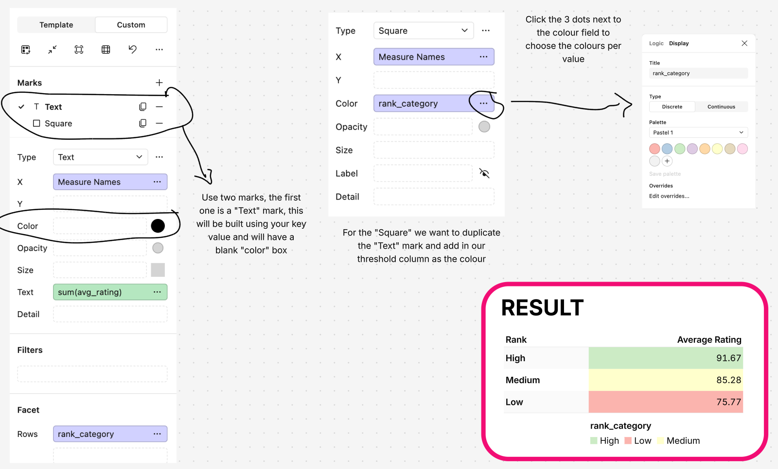
How to color individual values in a table
With the custom table visualisation, you can easily change the color of your text mark by adjusting settings in the right-hand panel.
First, set up your thresholds using a CASE statement (you can do this in a SQL cell or a calculated field!) to create a new column, then use this column to automatically change the color of your table's text mark based on the values.
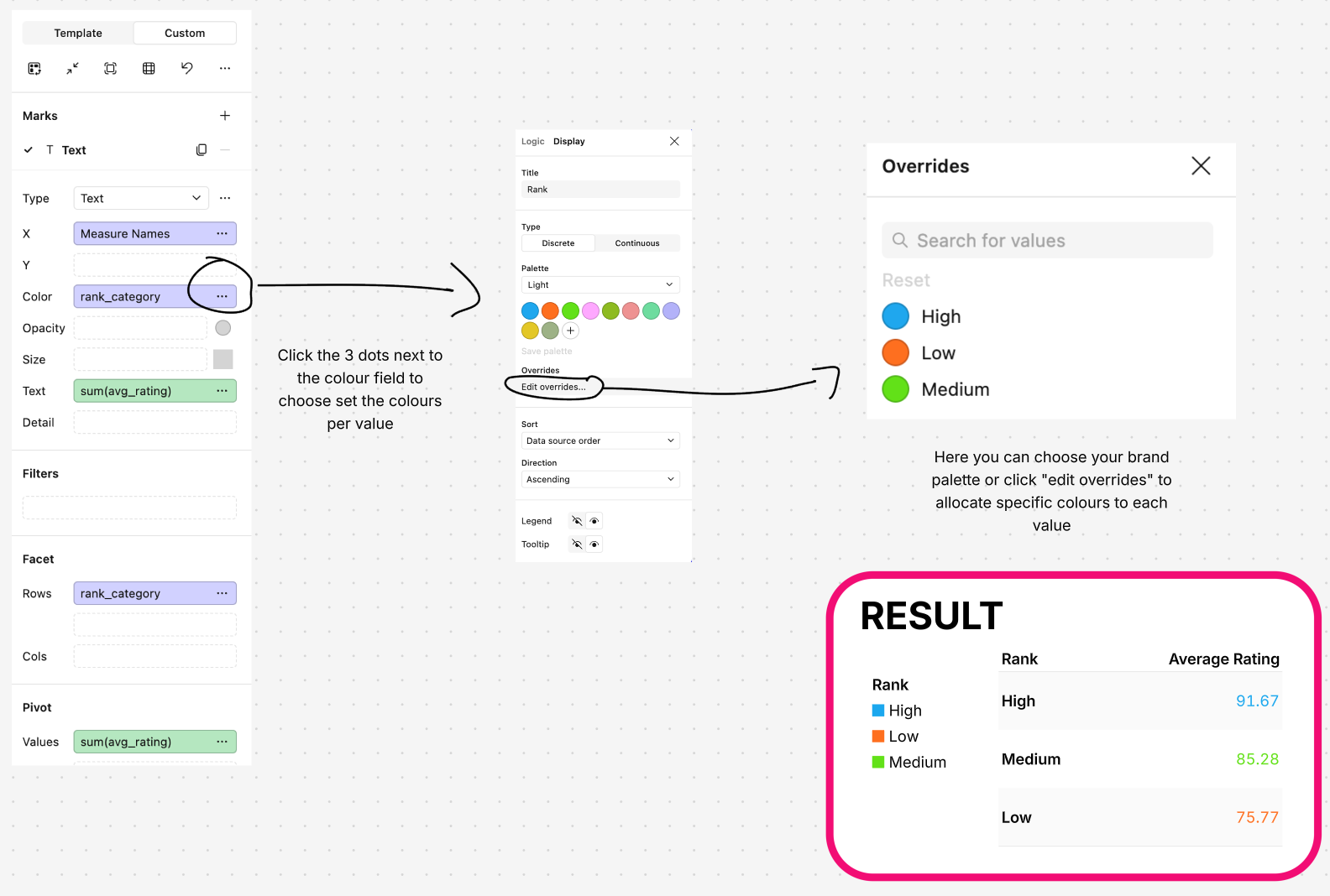
How to color individual rows in a table
Similar to the text coloring, we can make use of marks in the custom table visualisation to easily change the background colors of rows by adjusting settings in the right-hand panel.
Set up your thresholds using a CASE statement to create a new column, then use this column to automatically change the color of your cell background.
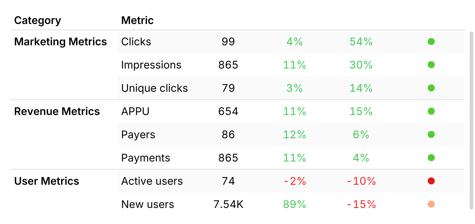
Creating tables with coloured flags
Coloured flags in tables helps analysts and key stakeholders quickly identify trends and anomalies.
Here, we will identify how to:
- Add numbers with a colour scale
- Add performance flags
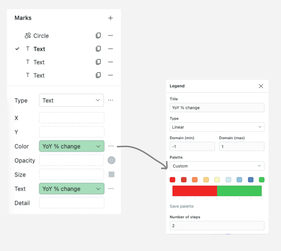
Numbers with a colour scale
The fields 'WoW %' and 'YoY %' are common performance metrics that are often coupled with a colour scale indicating whether an outcome is positive or negative.
To add a colour scale such as red and green:
1. Pull the chosen field into Colour under the Custom tab.
2. Select the colour range and specify the Number of steps - here we've chosen 2.
3. If you're working with % values, define the domain min and max as -1 and 1 respectively. Otherwise, define according to your data range.
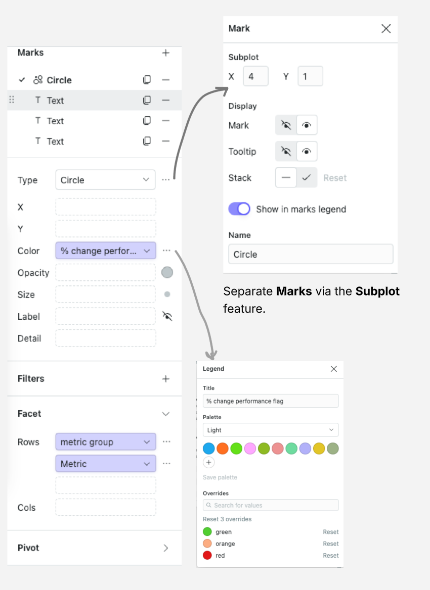
Performance flag
You can enable even quicker identification of summarised performance at a glance.
In the source data, we've created a summary field with assigned colours. We assign these based on metric performance across fields: 'green' for all positive values, 'red' for all negative, and 'orange' for mixed results (you could do this via a case statement).
Once the summary column is ready, you can pull the summary performance field under a Circle or SquareMark.
Then, pull the field into Colour and match the colour to the summary value.