Getting started with visuals
Visuals in Count are quick to create while giving you full flexibility when you need more control. This tutorial walks through the essential steps for building visuals:
Tutorial summary
Learn to create customizable data visualizations through visual cells, including charts, tables, and pivot tables, with data governance and formatting tips.
What you will learn
In this tutorial, you will learn how to:
1. Create a visual – use the toolbar, shortcut V, drag a column from the Data Sidebar, or hover next to an existing cell and select +.\
2. Select a chart layout – choose a chart type from the icons.
3. Map your data fields – drag fields to X, Y, color, size, and other channels.
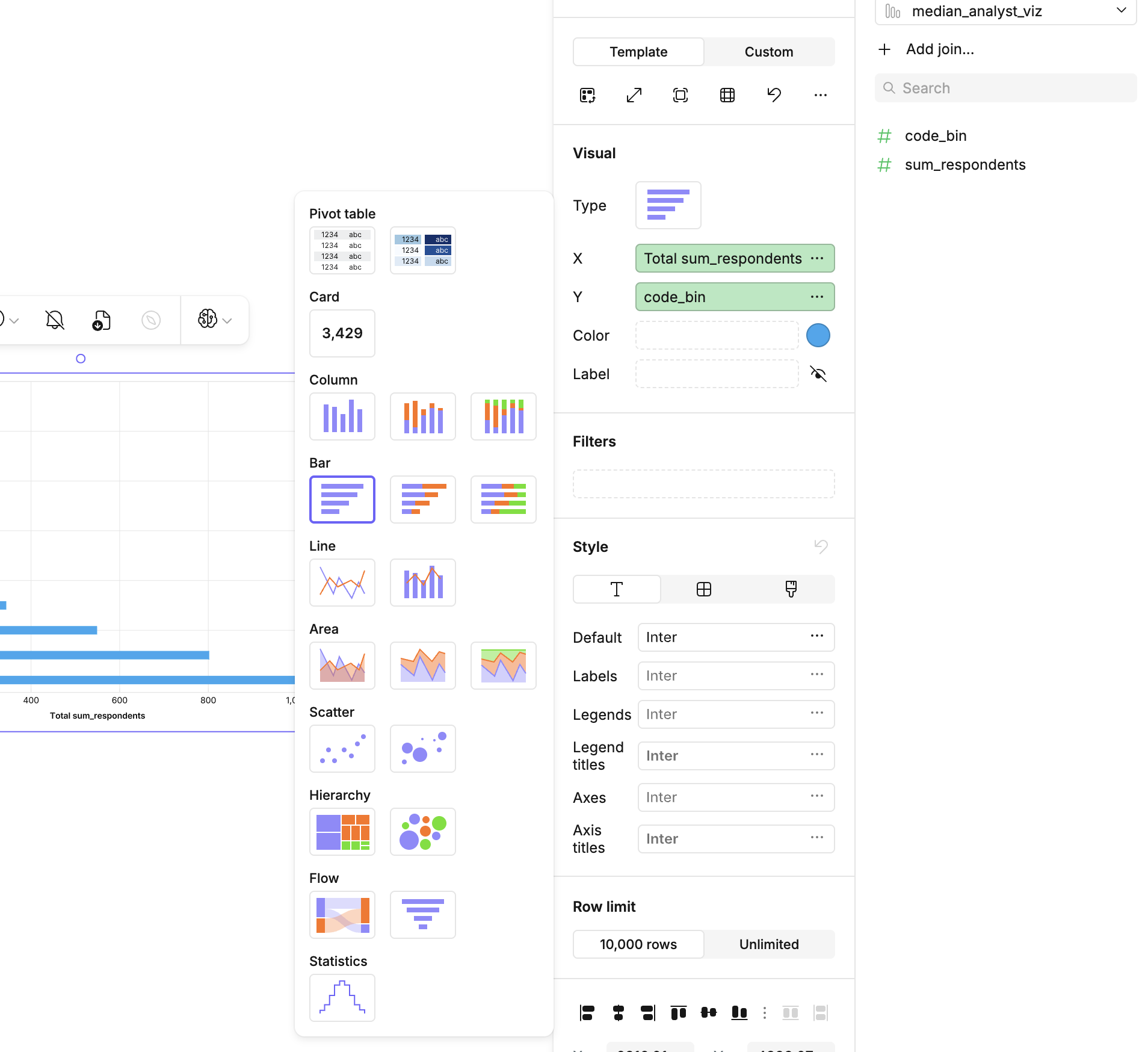
4. Set aggregations – use the ellipses (...) menu next to a field to choose totals, counts, averages, or other aggregates.
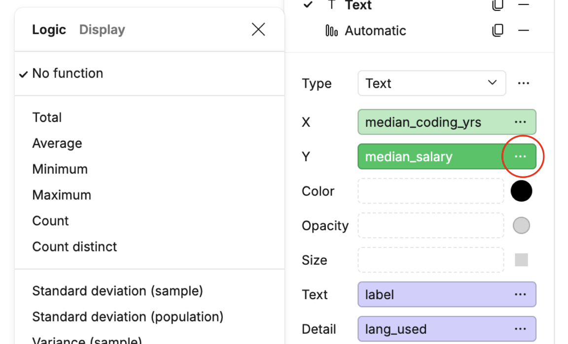
5. Format your visual – from the same menu, select the Display tab to adjust colors, labels, axes, and titles.
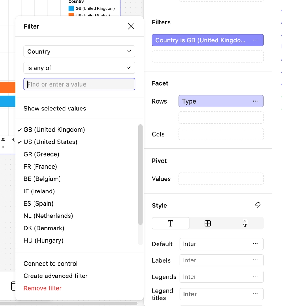
6. Filter your data – drag a field into the Filter channel or connect it to a control.
7. Present tables – create a Table cell or use the Pivot Table visualization.
8. Style your chart – fine-tune fonts, gridlines, and backgrounds in the Style panel.