Pivot Table
Pivot tables summarise data into a grid, letting you arrange dimensions into rows and columns with measures aggregated into values.
They’re useful for breaking down data by multiple categories, spotting patterns, or comparing across groups.
Template options
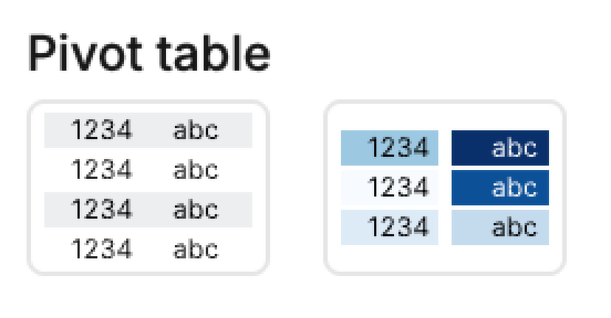
1. Basic pivot table → displays rows, columns, and aggregated values.
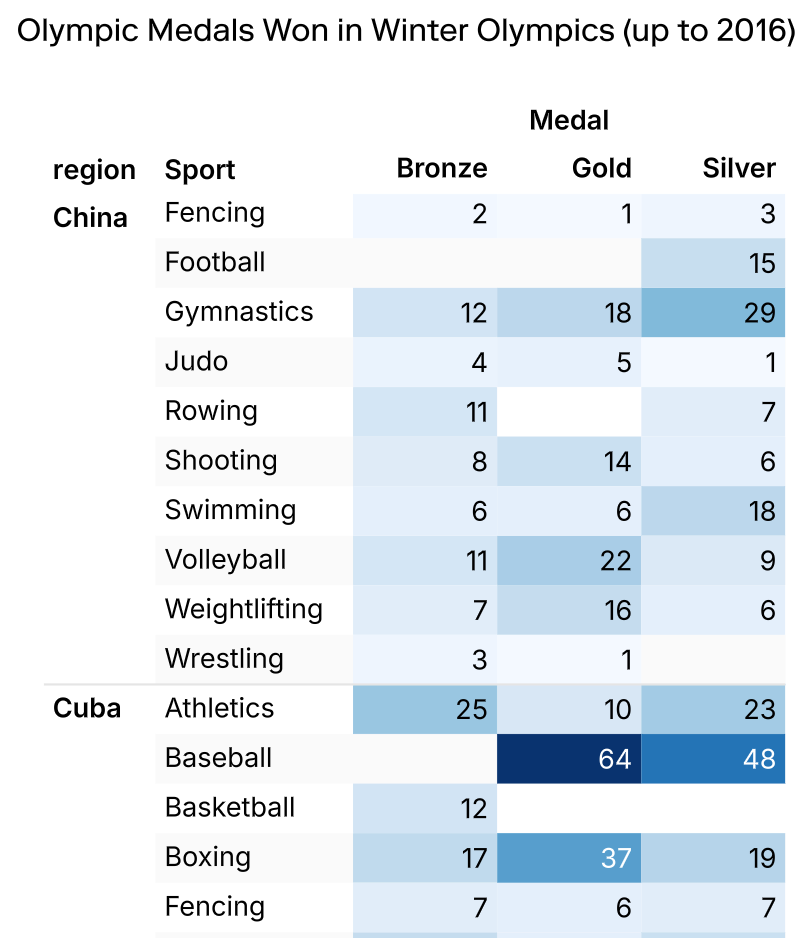
2. Pivot table with color → adds conditional formatting to highlight differences or ranges in the data.
Mapping options
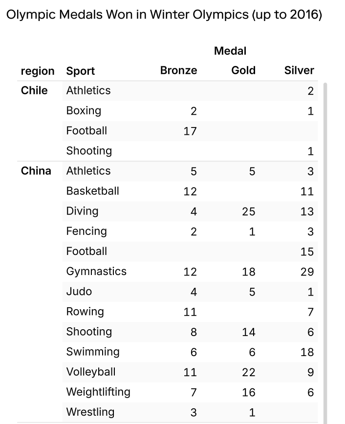
• Rows → Dimension(s) to group along the vertical axis. Multiple fields can also be added here, with order controlling the hierarchy.
• Cols → Dimension(s) to group along the horizontal axis. Multiple fields can also be added here, with order controlling the hierarchy.
• Values → Measures to aggregate (sum, count, average, etc.).
• Color → Applies conditional formatting to values.
Pivot table versus table
Pivot Visual
• Great for summarising data
• Easy grouping across rows/columns
• Less flexible around sorting/filtering
• Cannot export pivots in their pivot format
Table Cell
• Great for quickly visualising your data
• Easy sorting and filtering
• Can work with aggregated data from the SQL cell
• Good for exporting the CSV in the same format
Troubleshoot
Sorting the pivot table
If you have created a Pivot Table to display your data, but when you try to sort your data by column it doesn't appear to work as you expected, it may be that a standard table is more suitable for your use case. This video explains the difference between these two formats.
Embedded Content
Embedded content: https://www.loom.com/embed/dba6eb015e5843d48c987ae3acdfd14c
Adding colour scale to one column
- Switch to Custom tab for your pivot table
- Change Marks -> Type from Automatic to Square
- Add your column to apply the scale to into Color and Label
- In Color, navigate to Display and alter the color palette as preferred
- To add additional columns with a color scale, add/duplicate your Mark, move the x-axis Subplot setting up by 1 (this determines it's position), and modify the Label and Color field to your new data point, editing the scale palette as earlier outlined.
Embedded Content
Embedded content: https://www.loom.com/embed/8fdb8f4380ed4177b744d6a41a8d3bd2
Adding row totals
- Switch to Custom tab for your pivot table
- Move your row facet field to the y-value channel
- Add the Measure Values into Text
- Duplicate the Text Mark (to create another Mark)
- Change your y-value to Measure Names - this will add a summary in.