Advanced visualizations
This advanced visualisation tutorial shows you how to go beyond templates in Count. Switch to the Custom tab to layer marks, use facets/subplots, pivot measures, and add table calculations.
Tutorial summary
Custom visuals give you deep control over layout, marks, channels, and styling. Start from a template visual (recommended), then switch to the Custom tab when you need more control.
What you will learn
- Layer multiple marks (e.g., bar + line) to enrich a single visual.
- Configure subplots to build a grid of related charts.
- Facet a chart to repeat it across values (e.g., per country).
- Encode channels (x/y, colour, size, shape, text, detail) and styling.
- Use secondary axes, control stacking, and fine‑tune formatting.
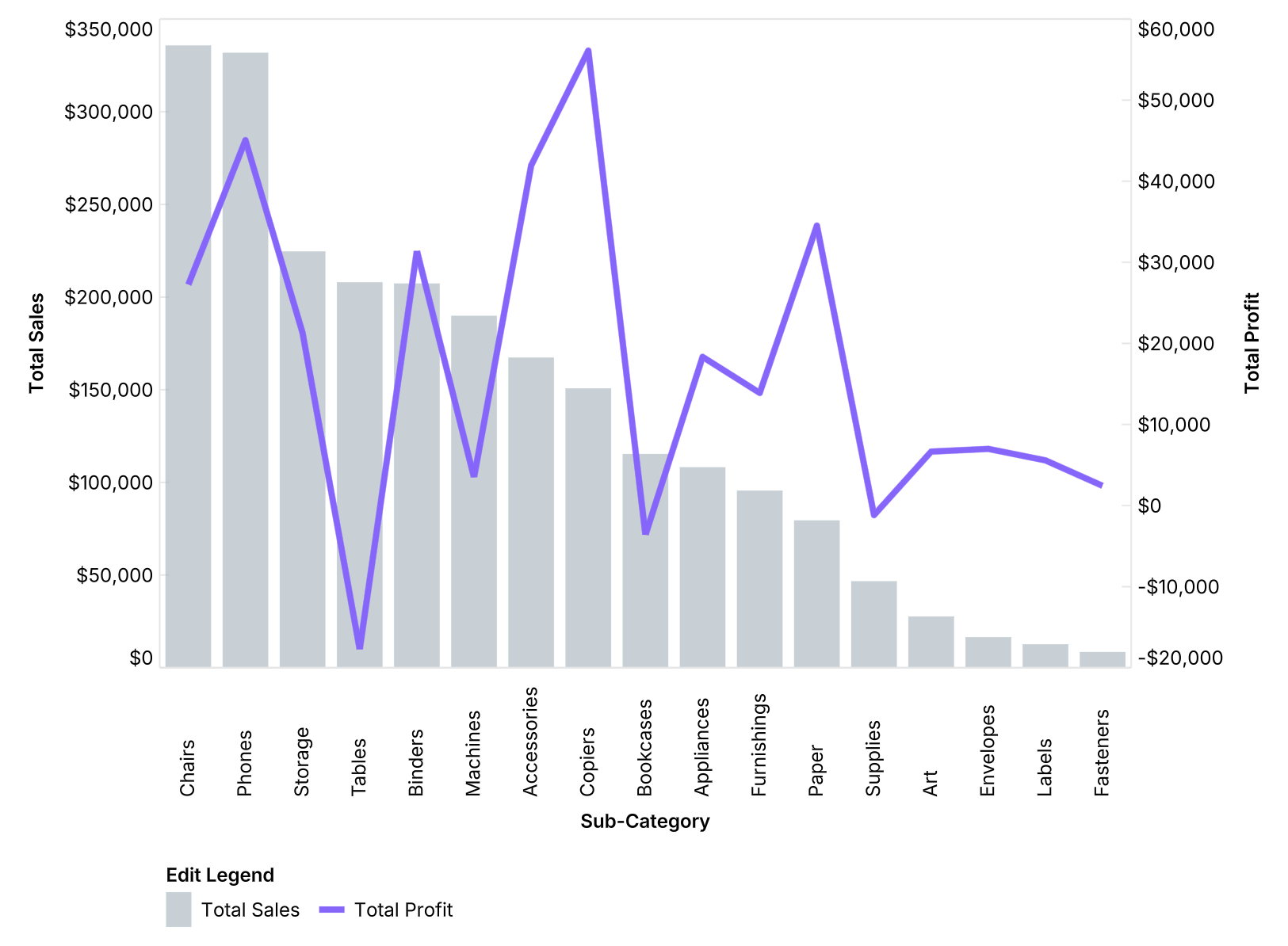
Marks (the building blocks)
Marks are the core elements of a visual — bars, lines, circles, areas, etc.
- Add or duplicate marks to layer quickly
- Change type at any time (e.g., area → bar → line).
- Independent settings for each mark: field, colour, axis, stacking.
- Layer order matters: the order in the design panel = front‑to‑back on the chart (drag to reorder).
- For different scales, put a mark on a secondary axis (via the field’s Display options).
Channels & tooltips
You have access to the full set of encodings.
- X / Y: primary quantitative/temporal/category encodings.
- Colour / Size / Shape / Text: reinforce categories, magnitude, or labels.
- Detail: add extra fields to the tooltip without drawing them on the canvas.
- Use Display options to rename axes/legends and format numbers/currencies.
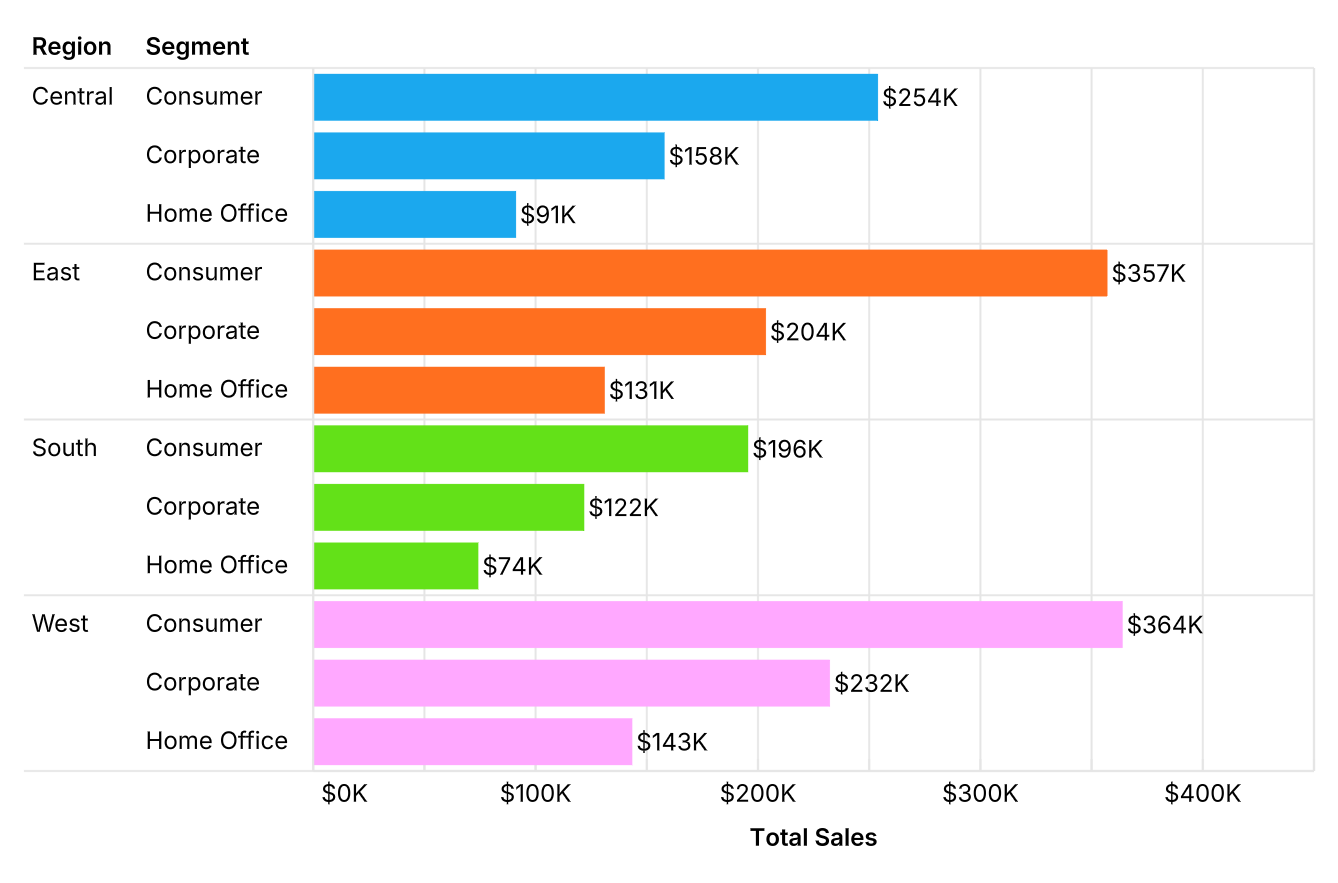
Facets (repeat a chart per group)
Facets repeat the same visual across groups using shared axes/scales.
- In this example: facet by Region to compare identical charts per region.
- Best for like‑for‑like comparisons where scales should match.
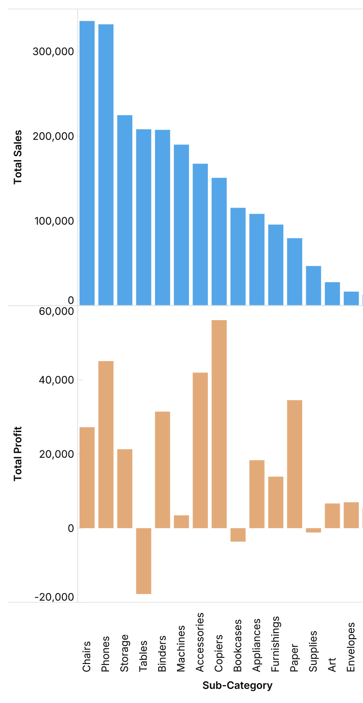
Subplots (a grid of related charts)
Subplots place charts on separate axes within one visual using subplot x/y coordinates.
- By default a chart sits at x=1, y=1. Access these settings in the ... menu next to the mark type.
- Set x=2 to place a chart to the right, y=2 to place one below.
- Subplots can share one common axis, while the other axes are independent and fully customisable (ranges, formats).
- Use when charts need different scales or encodings but should live together.
Pivoting (compare measures with one mark)
Pivoting reshapes multiple columns into Measure Names and Measure Values.
- After pivoting, map Measure Values → Y and Measure Names → Colour to compare measures with a single mark (e.g., multi‑line or stacked bars).
- For bars, toggle stacking in the mark options; disable to show bars side‑by‑side.
Aggregations & bins
Find these in the Logic tab of a field’s ... menu.
- Switch between aggregations (sum, avg, min, max, etc.).
- Bin numeric fields to create buckets; adjust bin size.
- Swap a binned field from continuous → discrete to present a classic histogram.
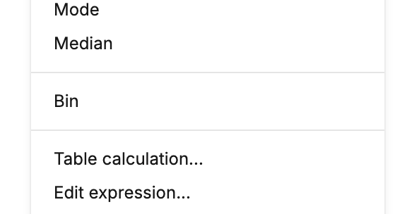
Table calculations
Apply transformations after the visual has aggregated data.
- Examples: Percent of total, Percentile, Rank.
- Choose the context (e.g., Table for all cells, Table down by column).
Custom expressions & functions
Create new metrics or categories within the visual.
- Edit expression to define logic (e.g.,
Profit / Sales) - Use functions and conditions (e.g.,
CASE WHEN, AVG).