Bar And Column Charts
Bar and column charts display values across categories using rectangular bars.
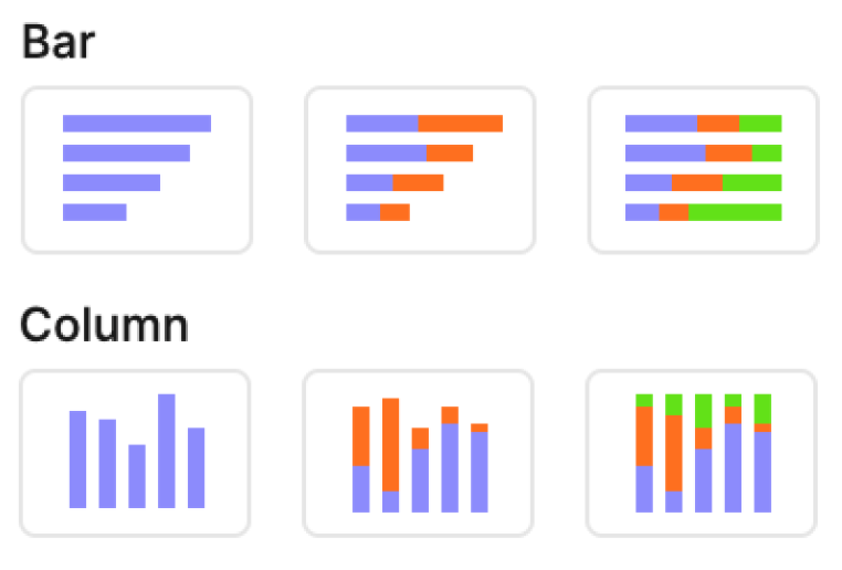
They make it easy to compare magnitudes between groups, see rankings, or show parts of a whole when stacked. The only difference is orientation: bar charts run horizontally, while column charts run vertically.
Template options
1. Simple bar → shows one measure per category.
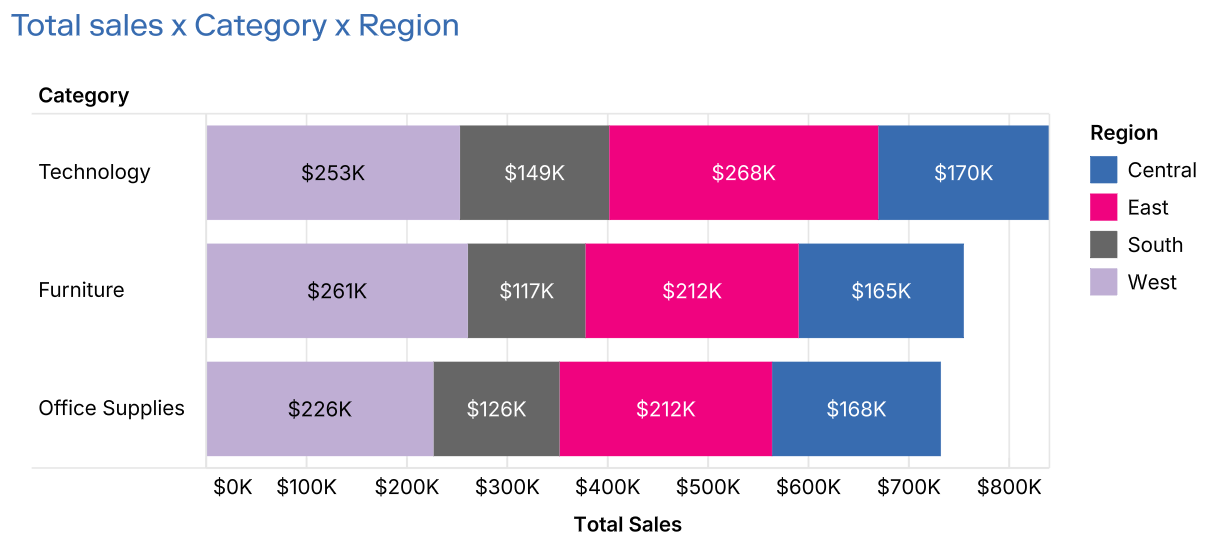
2. Stacked bar → layers multiple measures or series within each category.
3. 100% stacked bar → normalizes values to percentages, comparing contribution across categories.
Mapping options
• X → Dimension for category values (column variant) or measure for length (bar variant).
• Y → Measure for column height (column variant) or dimension for categories (bar variant).
• Color → Splits each bar into series, enabling stacked or 100% stacked variations.
• Label → Annotates each bar or segment with text.
Tips
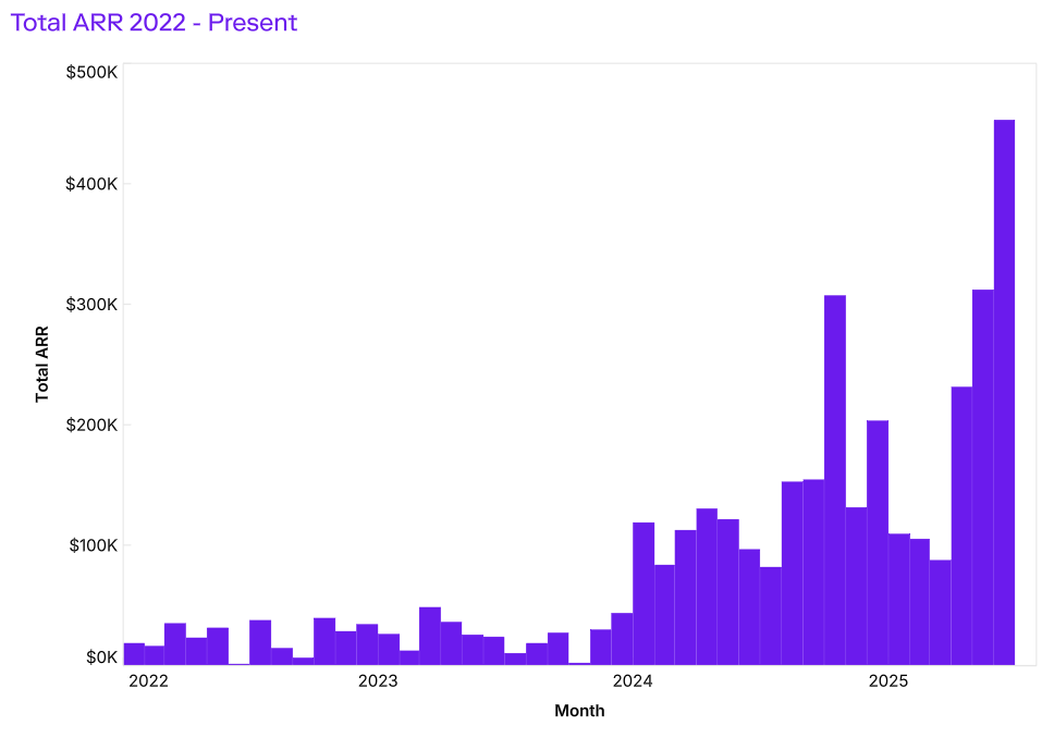
1. Use bars for ranked comparisons, columns for timelines or sequential categories, and stacked versions for part-to-whole analysis.
2. Keep category labels short, or rotate them for readability. You could also flip the visual if you decide to switch between bar and column charts.
3. Use stacked bars to show contributions, but limit the number of series (5–6 max) for clarity.
4. Choose 100% stacked when the focus is on proportions instead of absolute values.
Troubleshoot
Customizing labels on barcharts
When customising labels on a chart beyond a single field, you have two main options:
1. using calculated fields in a label
2. using text marks over the bar chart
Option 1: using calculated fields in a label
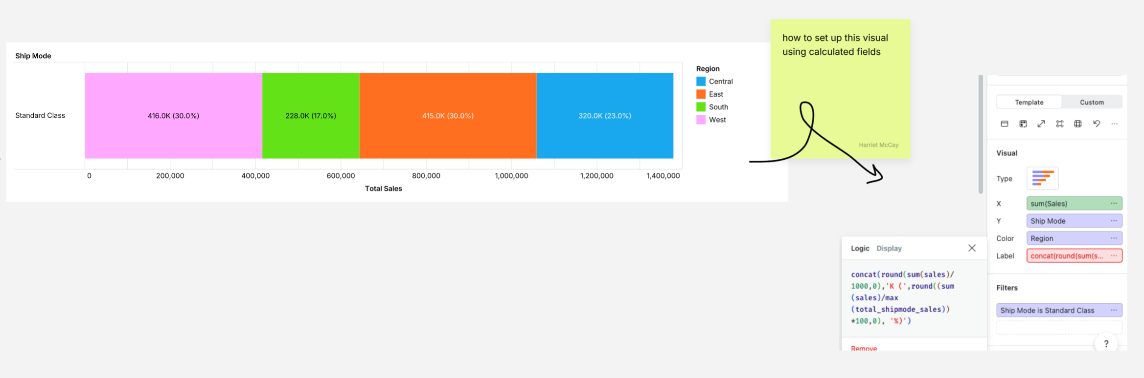
Option 2: using text marks over the bar chart
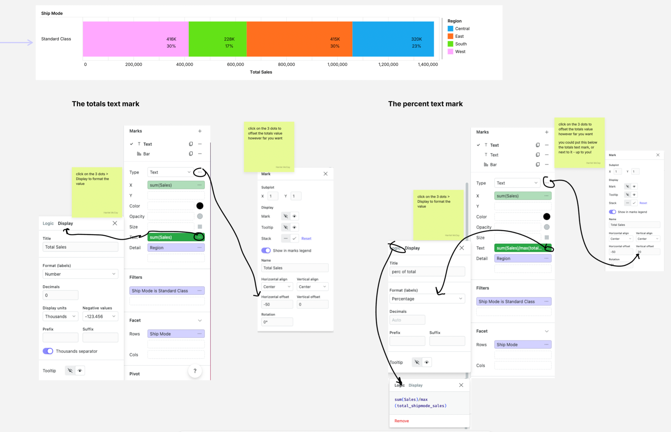
Showing multiple values on a barchart
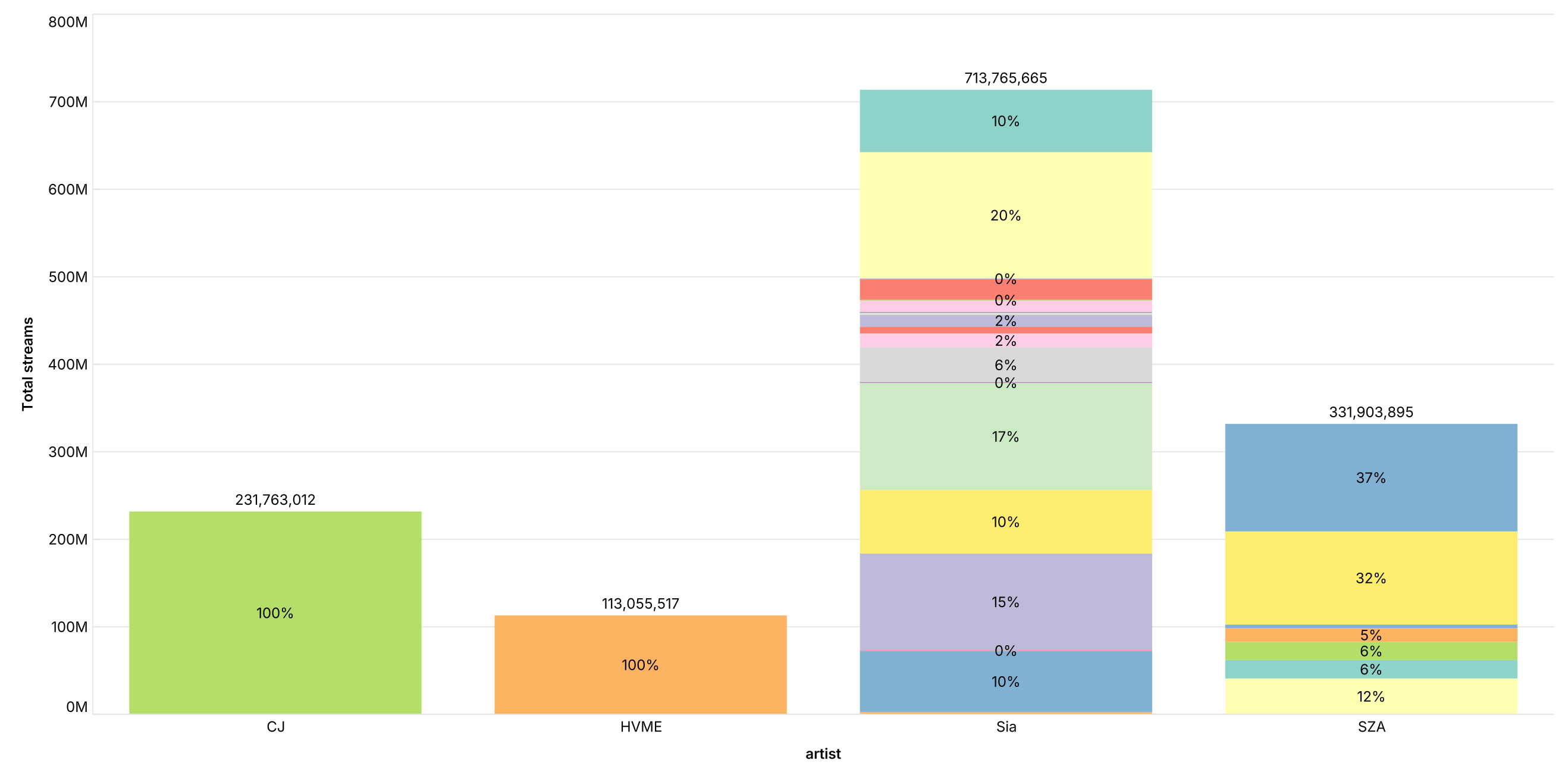
Bar charts can display multiple values at once, including both total values (at the top) and percentages (within bars) simultaneously, giving users both absolute numbers and relative proportions in one clear visualization.
Adding in multiple values
- Start with stacked bars: Select data → stacked bar visualization → switch from 'template' to 'custom'
- Add the percentage layer: Split bars using the color field, add values to the label field, click 3 dots → normalize data to show percentages of each segment
- Add the totals layer: Duplicate the bar mark → change type to "text", remove the color-splitting metric, remove normalization to show total values
This will result in a bar chart with percentage breakdowns inside each bar and total values displayed at the top - perfect for showing both the big picture and the details simultaneously.