Scatter Chart
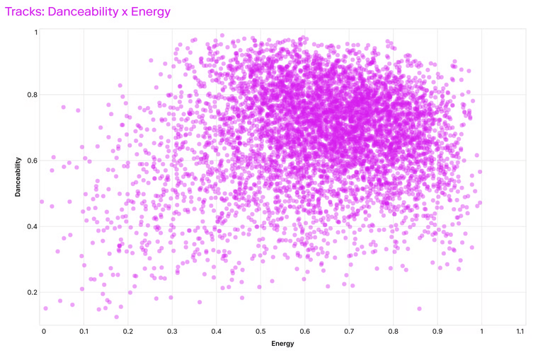
Scatter charts plot values along two numeric axes, making it easy to see relationships, clusters, or outliers.
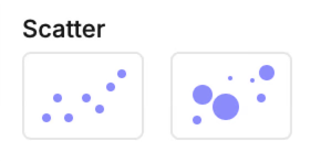
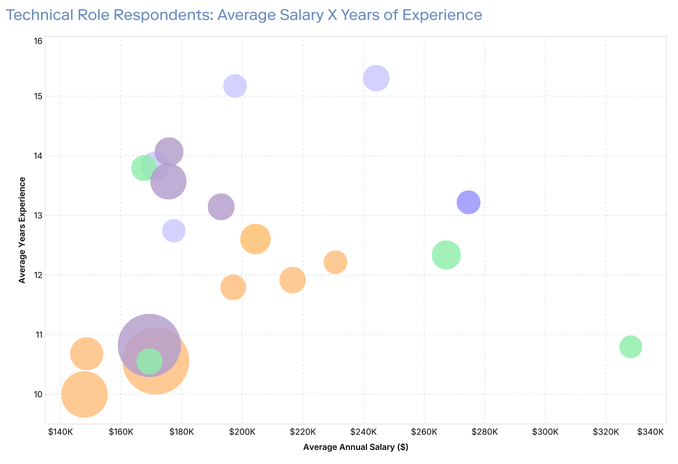
A bubble scatter variation adds a third measure by changing the size of each point.
Template options
• Simple scatter → plots points by X and Y values.
• Bubble scatter → plots points by X and Y, with size mapped to a third measure.
Mapping options
• X → Measure for the horizontal axis.
• Y → Measure for the vertical axis.
• Color → Dimension to split points by series.
• Size (bubble variant only) → Measure for bubble size.
• Label → Annotates each point with text.
Tips
• Scatter charts work best when both axes use continuous measures.
• Use Color to highlight group differences, but avoid too many categories (over 6–7 colors can be hard to read).
• For bubbles, make sure the size measure has a meaningful range to suit your data, you can adjust the range limits in the Display options for that field.