Line Chart
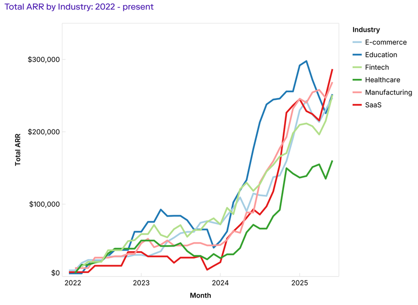
Line charts connect data points with lines, making them useful for showing trends, changes, or comparisons over time.
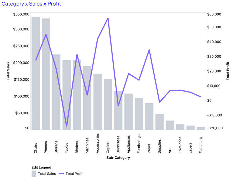
Line charts can also be combined with bars for dual-axis visuals that highlight relationships between two measures.
Template options
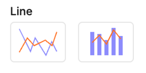
1. Simple line → plots one or more series across a continuous axis.
2. Combo (bar + line) → overlays a line series on top of bars to compare different measures in the same chart.
Mapping options
For line charts
• X → Dimension for the horizontal axis (often time or ordered categories).
• Y → Measure for the vertical axis (line height).
• Color → Splits lines into series.
• Label → Annotates points with text.
For combo (bar + line)
• Cols → Dimension for the horizontal axis (shared by both bar and line).
• Bar
• Line
Tips
- Line charts work best with continuous or ordered categories (e.g. time, sequence, ranking).
- Avoid too many series (over 5–6) to keep lines readable.
- Use combo charts when you want to highlight the relationship between two measures, such as volume (bars) and rate (line).