Hierarchy Chart
Hierarchy charts visualize proportions within categories, making it easy to compare part-to-whole relationships.
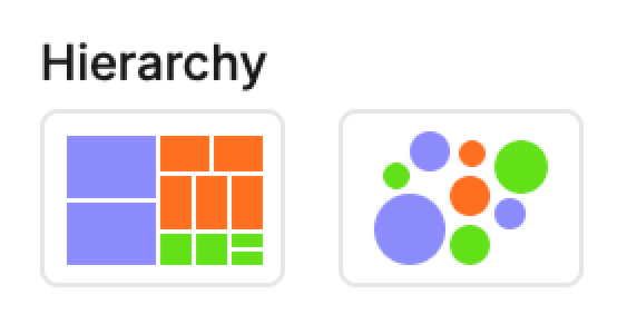
• Treemaps use nested rectangles sized by value.
• Packed bubbles use circles sized by value.
Treemap
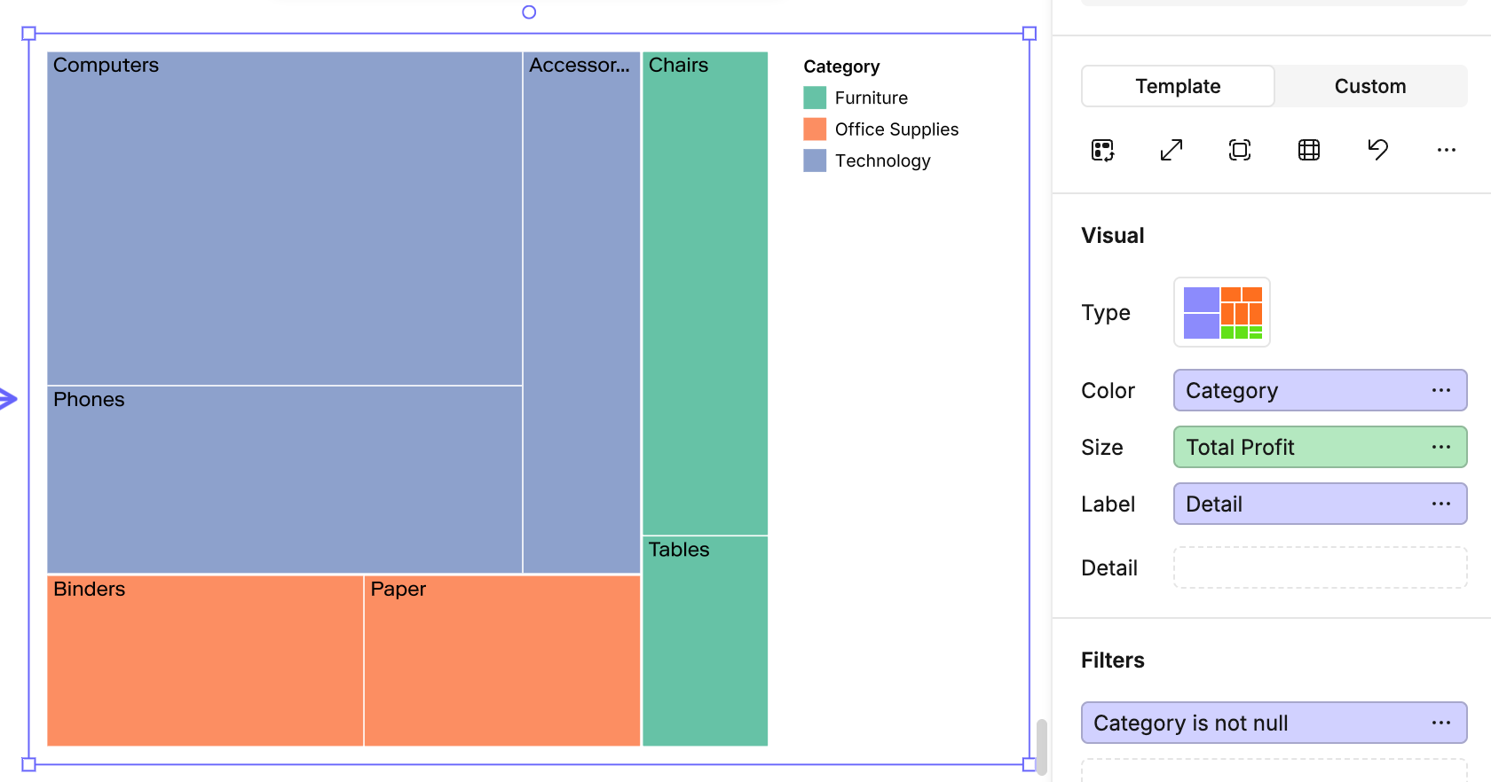
Mapping options (Treemap)
• Color → Dimension or measure for rectangle shading.
• Size → Measure to define rectangle area.
• Label → Adds text to each rectangle.
• Detail → Adds extra breakdown inside each rectangle.
Packed bubbles
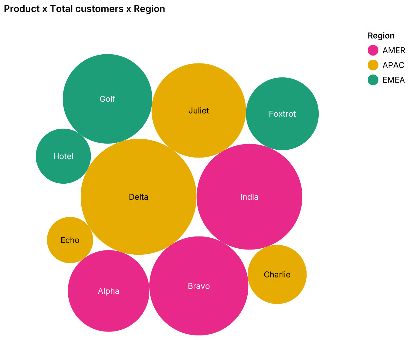
Mapping options (Packed bubbles)
• Color → Dimension or measure for bubble shading.
• Size → Measure to define bubble size.
• Label (optional) → Annotates each bubble with text.
• Detail (optional) → Adds extra grouping dimension.
Tips
• Both visuals are best for part-to-whole comparisons.
• Use Size for your main quantitative field.
• Detail lets you drill into a second dimension.
• Avoid too many small values—they can create clutter and make shapes too small to interpret.
• Use Color sparingly: too many categories can overwhelm the chart.