Design sidebar
The Design sidebar (right-hand side of the screen) contains all the controls for adjusting the look and behaviour of your canvas.
You can open/close the sidebar using the arrow button at the top, or with the shortcut Cmd + \ (Mac) / Ctrl + \(Windows).
Tabs
- Design – Controls for appearance, data, connectors, and export.
- Alerts – Configure alerts for your canvas.
Zoom & View Options
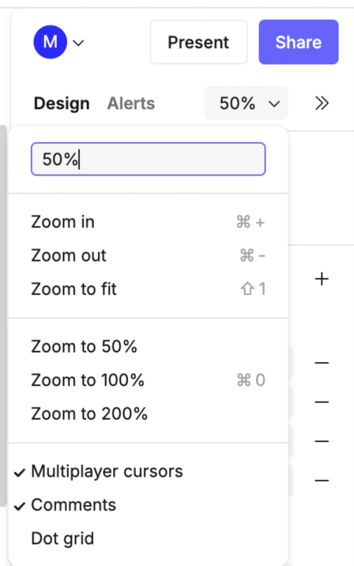
At the top of the Design tab you’ll see a zoom dropdown with quick access to zoom and display controls:
- Zoom in –
Cmd/Ctrl + + - Zoom out –
Cmd/Ctrl + - - Zoom to fit –
Shift + 1 - Zoom to 50%
- Zoom to 100% –
Cmd/Ctrl + 0 - Zoom to 200%`
Additional display options:
- Multiplayer cursors – Show or hide collaborator cursors in real-time.
- Comments – Show or hide comment indicators.
- Dot grid – Toggle a background grid to help align objects.
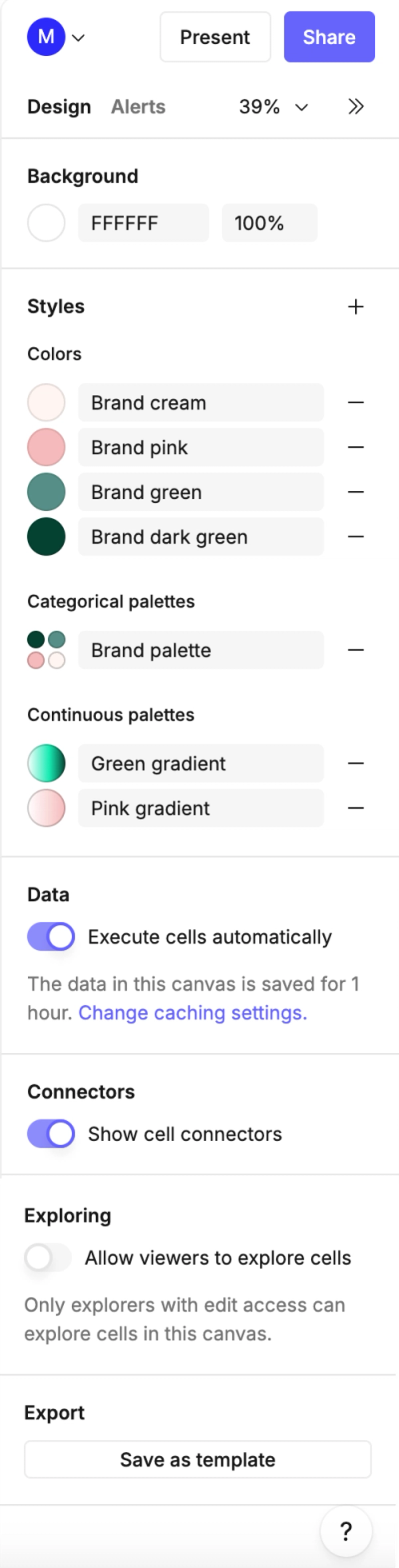
Background
- Background color – Set the canvas background with a hex code or color picker.
- Opacity – Adjust the background transparency.
Styles
Styles let you create shared visual elements you can reuse across your canvas.
- Colors – Save local color swatches for quick access.
- Categorical palettes – Define palettes for grouping categories consistently.
- Continuous palettes – Define gradients for numeric or continuous data.
Data
- Execute cells automatically – Choose whether cells in this canvas run automatically when opened.
- If a cell is prevented from executing automatically, it will show a message with an option to manually execute the query.
- Caching – The option in this sidebar lets you change the caching settings for your current canvas.
- Canvas caching can also be enabled or disabled in workspace settings, where the default caching behaviour is defined.
- Learn how to change canvas caching settings here.
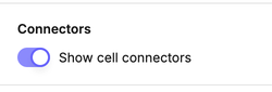
Connectors
- Show cell connectors – Toggle connector lines on or off. Connectors indicate when one cell references another.
- Note it is also possible to toggle connectors on/off for individual frames.
Exploring
- Allow viewers to explore cells – If enabled, viewers with edit access can interact with cells directly in this canvas.
Export to templates
- Save as template – Export the current canvas setup as a reusable template.
Top-right canvas controls
Above the Design sidebar, you’ll also see additional controls at the top-right of the canvas:
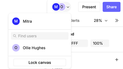
- Profile menu – Shows who is currently active in the canvas.
- Lock canvas – Switch between unlocked and locked mode:
- Unlocked (default) – Everyone shares the same live session, edits and interactions are synced instantly, and mouse cursors are visible to all. Best for collaborative exploration, development work, or workshops where you want everyone to interact together.
- Locked – Each visitor has their own independent session. Viewers can still use control cells (filters, dropdowns, sliders, etc.), but changes are temporary and only visible to them. Most objects cannot be edited (except comments and controls). Best for creating shared metric maps, interactive reports, or training canvases where the layout stays fixed but each person can explore the data on their own.
- Learn more about locking and unlocking canvases.
- Follow a collaborator – Click on someone’s avatar to follow their view around the canvas. Useful during screen-sharing calls, walkthroughs, or training sessions.
- Lock canvas – Switch between unlocked and locked mode:
- Present – Enter presentation view, hiding editing tools to focus on results.
- Share – Open sharing settings to invite collaborators or manage permissions.