Getting started with Count
Watch this tutorial to see how Count AI can accelerate your workflow and help you get up and running in minutes.
Getting started with Count (in minutes)
Count helps you move from raw data to trusted insights quickly, and then take meaningful next steps with your team.
1. Start with your data
- If your workspace already has database connections or catalogs set up, just start asking questions in the AI agent box.
- If you're new, the fastest way to begin is to drag a CSV file onto the canvas.
Once your data is available, you can:
- Ask your own question, or
- Choose from suggested prompts provided by the agent.
2. AI analysis — with full transparency
As the agent works:
- Its reasoning appears in the right-hand panel.
- You can expand any step to see exactly what it did.
But you don’t just get a chatbot response.
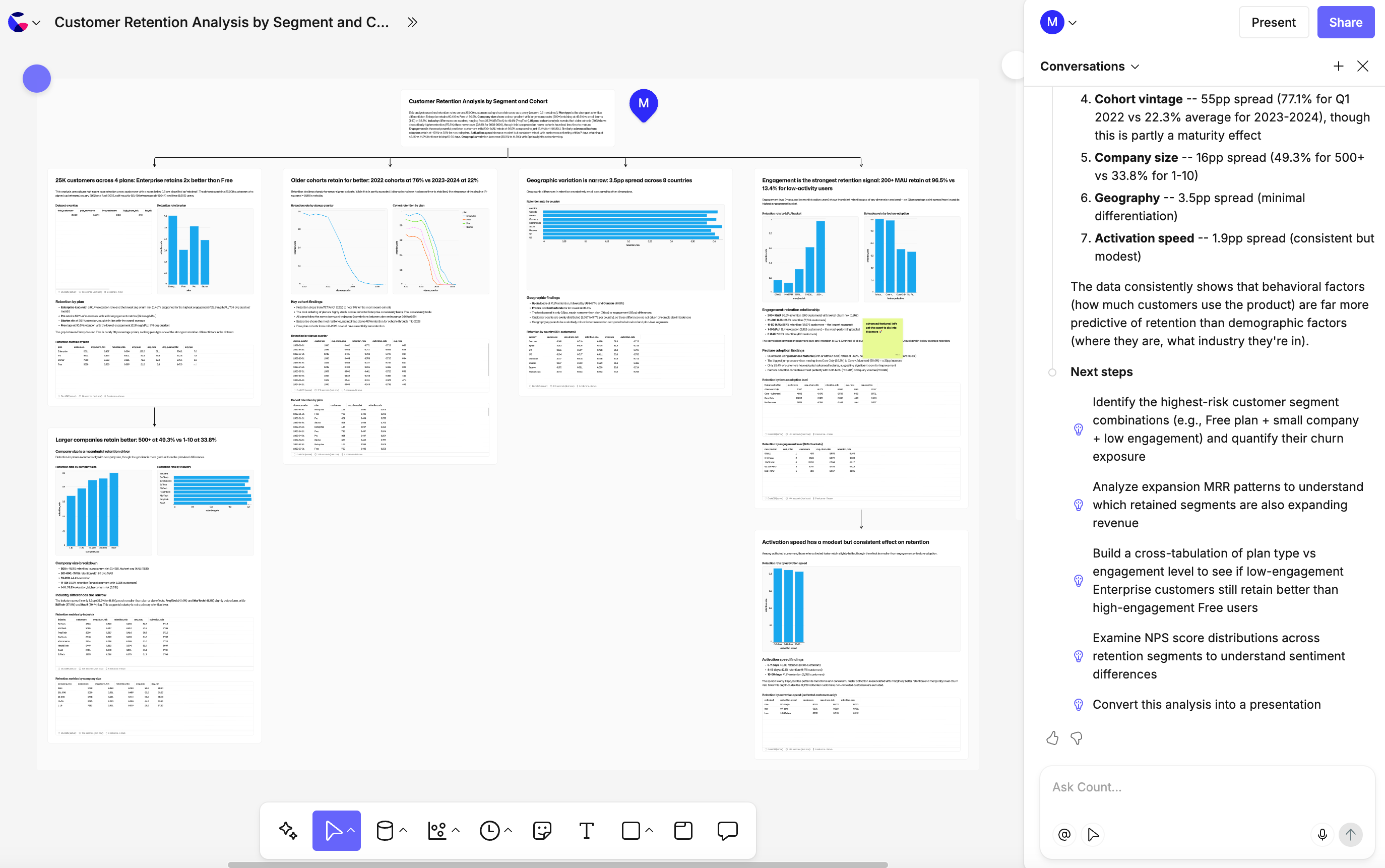
The agent also creates editable assets directly on your canvas, including:
- A summary of key insights
- Supporting tables
- Visualisations
- Structured frames for presentation
Everything it creates is fully editable:
- Adjust visuals using the visual editor.
- Inspect and edit any SQL used in the analysis.
- Export or modify code as needed.
This gives you complete visibility into how insights were formed, so you can trust and refine your results.
3. What to do next
After the initial analysis, you can:
- Continue iterating with the same agent.
- Use suggested follow-up questions.
- Ask the agent to reformat results as:
- A dashboard
- A slide deck
- A report
You can also:
- Add multiple agents to the same canvas.
- Base new questions on existing outputs.
- Select specific cells or datasets to include as context for deeper analysis.
4. Collaborate in real time
Count is designed for collaborative analysis.
- Use whiteboard tools to add notes.
- Tag teammates to join the canvas.
- Work together in real time.
- Review logic and validate outputs collectively.
This shared environment helps teams move from insight to decision faster.
5. Present and share
When you're ready to present:
- Switch to Presentation Mode.
- Select which frames to show.
- Step through insights cleanly in meetings.
Why this matters
Count doesn’t just help you generate insights quickly.
It gives you:
- Transparent, editable analysis
- A single collaborative workspace
- Flexible ways to refine and present findings
So your team can focus less on tooling — and more on making confident, data-driven decisions.