From ad hoc analysis to polished reports
Go from "interesting finding" to "boardroom presentation" with our complete workflow
Tutorial summary
Get started by exploring your data, then add visuals and interactive cells to bring your vision to life. Add finishing touches to your work, tag other team members in, and use presentation mode to create professional, branded reports.
What you will learn
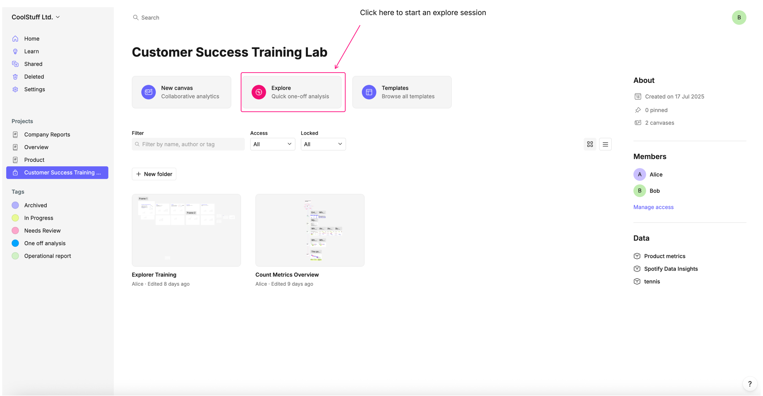
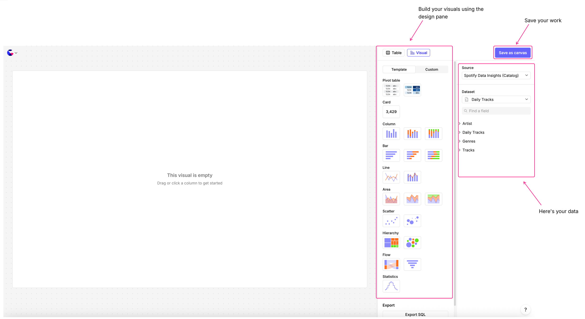
1. Getting Started
- Open a project with attached catalogs.
- Click Explore to start exploring your datasets.
- Navigate your catalog and begin building visualizations.
- Save your work as a canvas to begin building reports, dashboards or presentations.
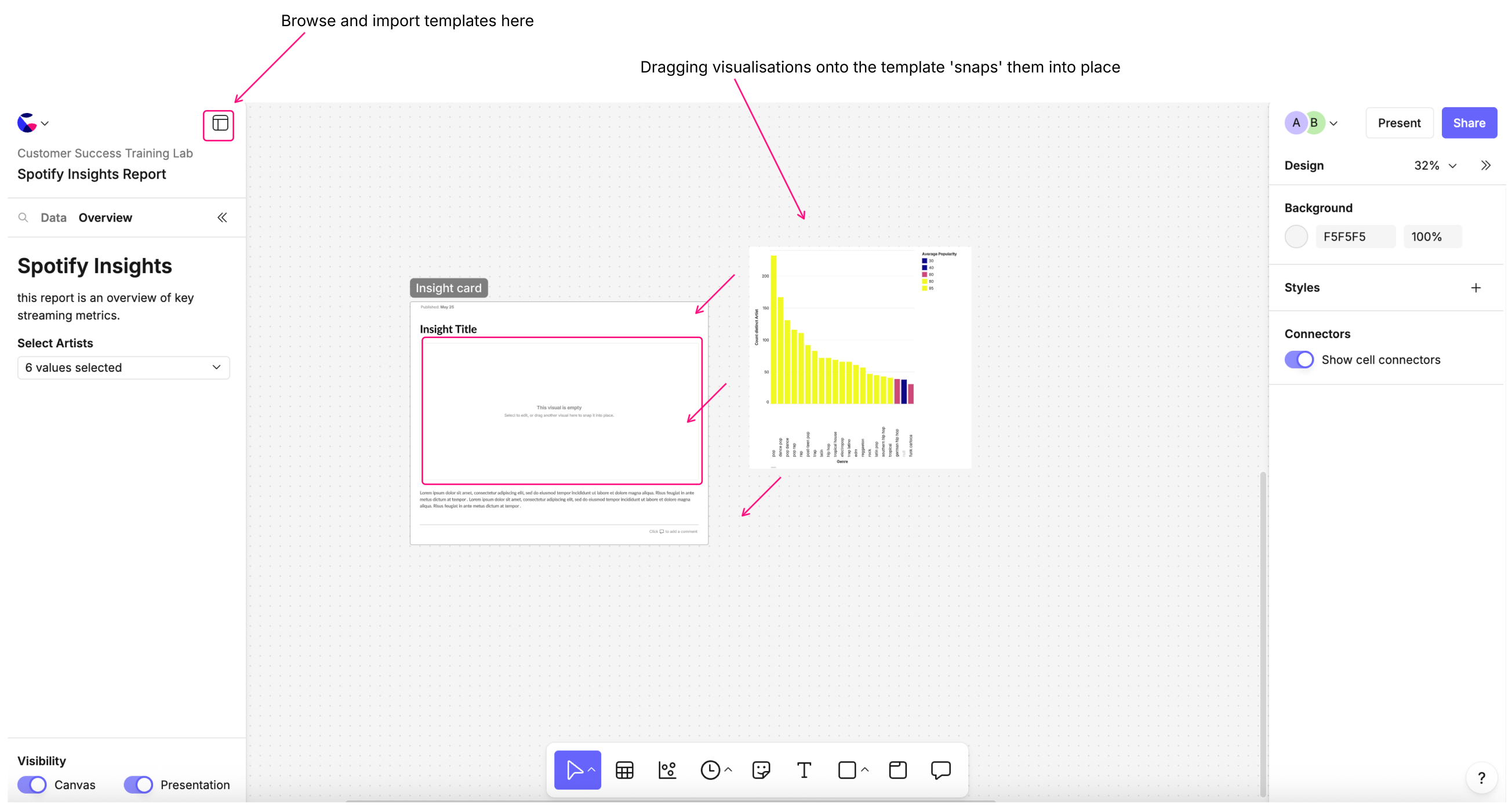
2. Using Templates
- Use built-in templates for quick, polished dashboards. Templates include pre-arranged visual grids for easy layout.
- Drag your visuals into the template; they automatically adjust to fit.
- Adjust titles, descriptions, and optional detail fields for clarity.
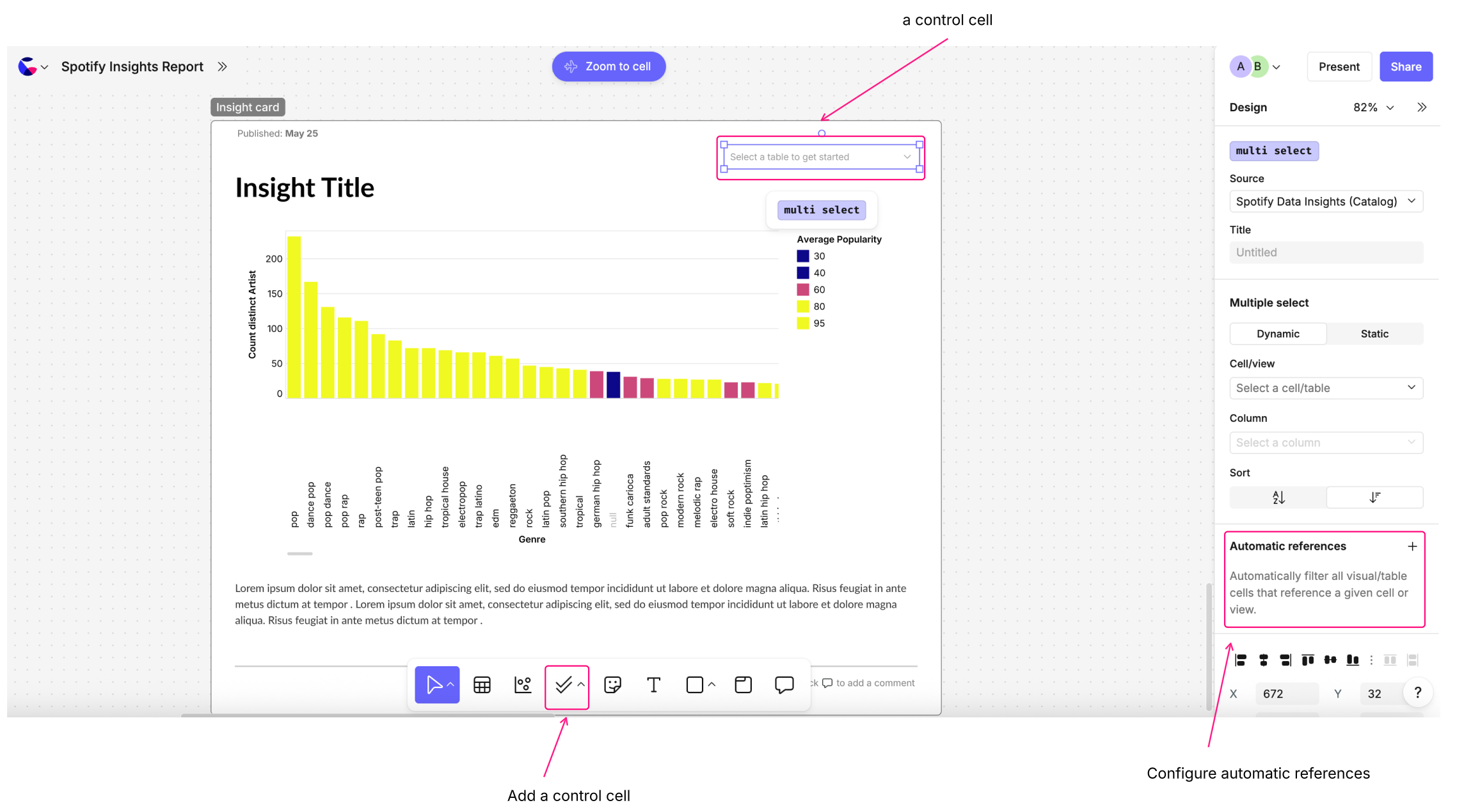
3. Adding Interactivity
- Control Cells: Add filters (e.g., multiple select) to your dashboard.
- Link controls to visuals using automatic references for efficiency.
- Scope controls to specific frames to avoid affecting unrelated visuals.
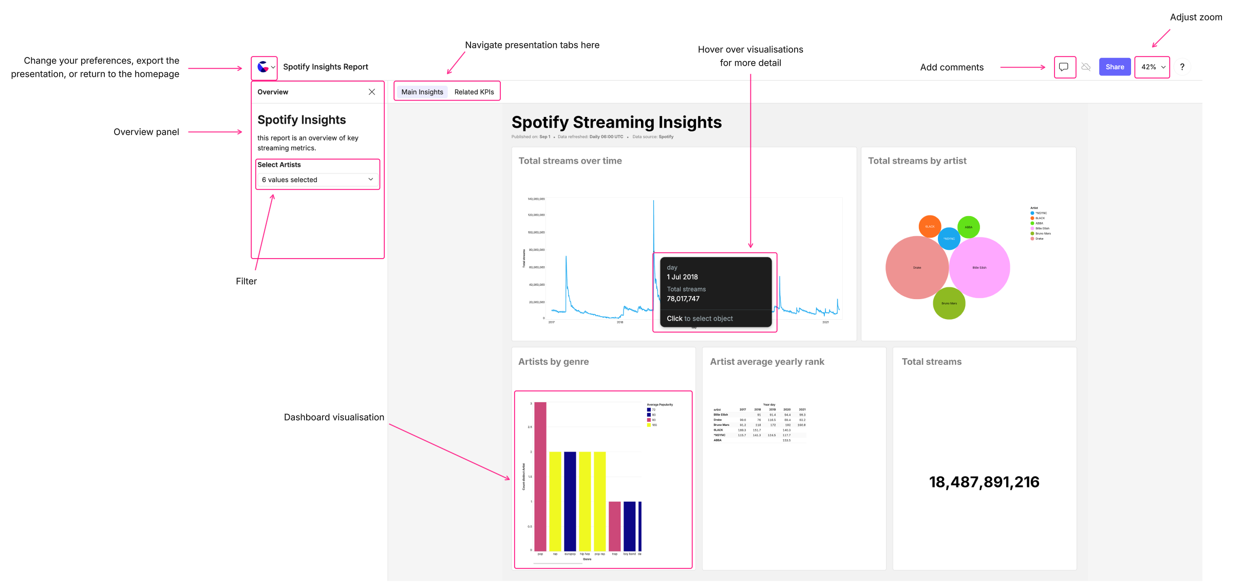
4. Finalizing Presentation
- Add headings and plain text for context.
- Include controls in the overview if needed.
- Jump into present mode to interact with the dashboard:
- Adjust zoom
- Hover for tooltips
- Pin or screenshot data
- Leave and reply to comments for collaborative feedback
5. Key Benefits
- Count templates speed up building reports, dashboards and presentations for low-code users.
- Visuals, filters, and layouts are easy to customize.
- Collaboration and presentation-ready results are seamless.