Visual recipes for the agent
Count has always had a powerful, flexible visualisation engine (see some examples in our Every Visual Under the Sun canvas). Now, working with the agent, you can build impactful visuals like these with very little manual effort: describe what you want instead of building it step by step.
Below are a few examples, each with the finished visual and the prompt for you to reuse.
How to use these:
- Copy and paste the prompt into your canvas.
- Edit the text to add information about the data you would like to use, and any other changes you would like.
- Feel free to ask the agent to edit the prompt for you if you want to make substantial changes to the charts.
- Either paste your finished prompt into the agent, or simply select the text box while you write a short prompt asking the agent to build the chart.
#Timeline with key events highlighted
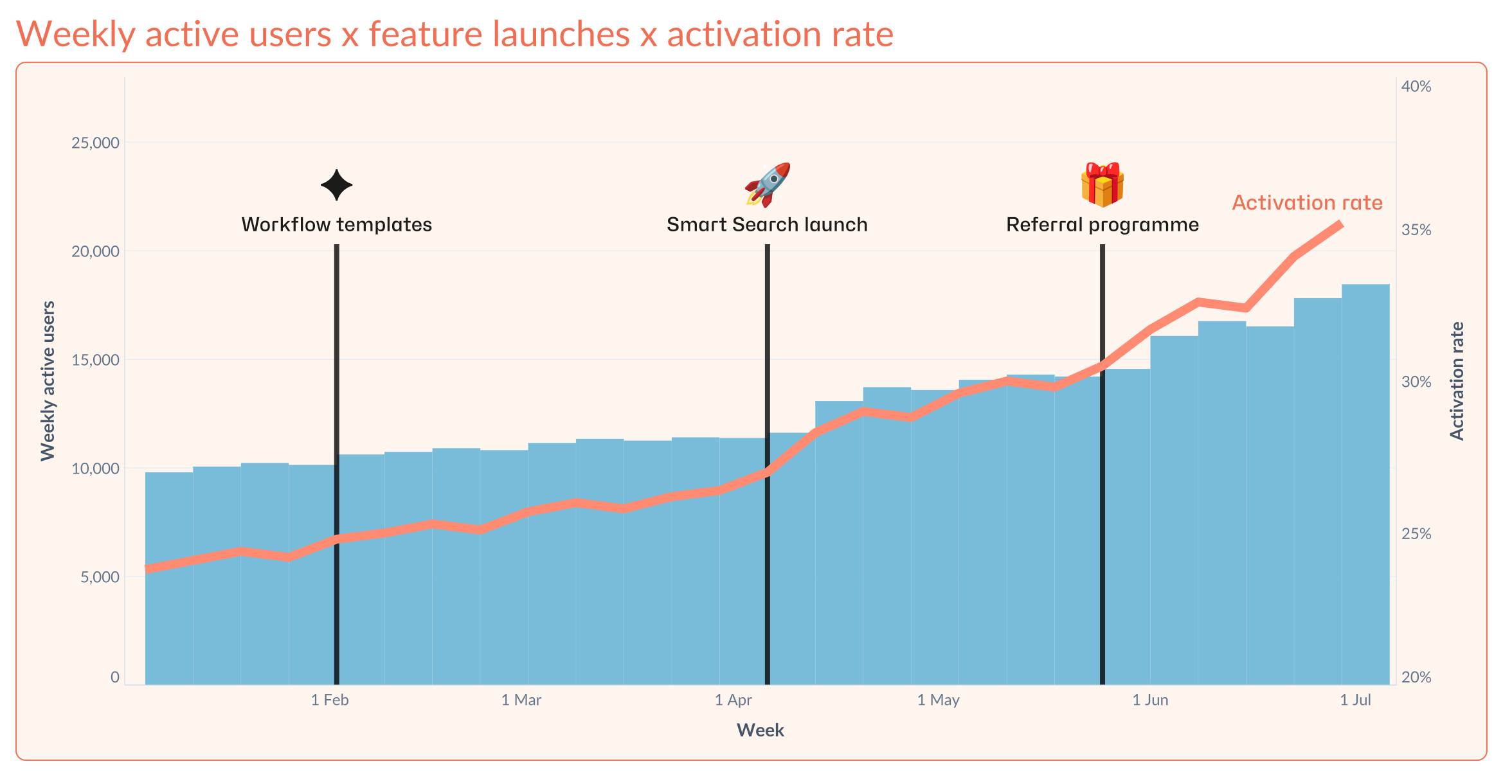
My data <select and/or describe your data sources here>
Build a combo chart with three layers on a shared week/date axis:
- Bars — my primary metric (e.g. weekly active users) per period.
- Line — a secondary metric (e.g. activation rate) on its own right-hand axis, as a percentage. Label the line directly near its most recent point (not just in a legend).
- Event flags — for each row in my events table (date, label, emoji), draw a thin vertical flagpole line at that date, with the emoji above the flagpole and a short label below the emoji.
Build one plot-ready dataset
Create a single chart dataset containing:
- One row per complete week with the primary and secondary metrics.
- Calculate the maximum of the primary metric and use a rounded upper bound on the left axis. Set that upper bound roughly 30–45% above the plotted primary maximum (40% by default; 25–40% is acceptable after rounding).
- Independently calculate the observed minimum and maximum of the secondary metric. Set an explicit right-axis range with meaningful room above its maximum—typically 20–30% of the observed secondary-metric range, with a sensible minimum buffer for near-flat series.
- One event series per event, with two rows at the same event-week x-position: a baseline row with flagpole y-value 0 and a top row at a consistent, adaptive height based on the padded primary-axis maximum (for example, 84% of that maximum).
- Separate adaptive y-positions for each event label and emoji, above the flagpole top and below the padded axis maximum. If events occur within a few weeks of one another, assign a collision group and stagger their label/emoji positions within that group. This must work for any number of events, not only a fixed set.
- Event annotation band and spacing. Reserve a clear upper annotation band between the tallest plotted bar and the top of the padded primary axis. Set every event flagpole top at the bottom of this band, above the tallest plotted bar — for example, at the greater of 105% of the plotted primary maximum or 84% of the padded primary-axis maximum. Place each event label above its flagpole, then place its emoji above the label. The emoji’s bottom edge must clear the label’s top edge by at least 8 px in the final rendered chart — not merely avoid overlap — and the gap must remain visibly generous at normal reading size. Keep every annotation fully inside the plot area and below the top of the axis.
- Endpoint-only coordinate fields for the most recent complete metric week.
Render the chart on a shared date x-axis
Use these conceptual layers, in this exact drawing order:
- Bars:
[PRIMARY METRIC]. - Line:
[SECONDARY METRIC]on the right-hand axis, formatted appropriately. - Event flagpoles: thin vertical lines, each connecting the chart baseline (0) to its adaptive top position.
- Event annotations: event label below the emoji, positioned above the flagpole.
- Line-end annotation: a single descriptive endpoint label, positioned at the latest line point.
Event flagpoles must render over the bars and line so they remain visible all the way to the bottom of the chart. This intentionally prioritises event visibility over having bars obscure the poles. Give each mark a clear, purpose-specific name in the visual editor.
Endpoint-label rule
- Create a text layer that uses the endpoint-only x/y coordinate fields, so it renders once at the latest complete period. Also apply a -10 vertical offset to the mark to leave some space between the line and text.
- Add a short line-end label - explaining what the line reperesents - to the chart-ready data only for the latest complete period, then map the endpoint text layer’s Text field to that label rather than using a static value. Do not include a metric value in the label unless explicitly requested.
- Use black or neutral-charcoal text for readability; it may differ from the line colour.
Axis and annotation rules
- Left y-axis: set an explicit domain from 0 to the calculated padded primary-axis maximum.
- Right y-axis: use an independent domain suitable for the observed secondary-metric range and apply the appropriate format.
- Keep clear vertical space among the highest bar, flagpole top, event label, and emoji.
- Use a clean x-axis with only orientation ticks. Remove background gridlines; retain clean axis spines.
Styling
- Bars:
#79BCDA - Line:
#FF8A72, size: 7 - Background:
#F7E7DC - Title and chart outline (1 px):
#F26E53 - Flagpoles, axes, event labels, emojis, endpoint label, and other text: neutral charcoal,
- Flagpoles size: 4
- Emoji size: 32
- Use a plain-English chart title that names the two supplied metrics and notes that only completed weeks are shown.
- Title font: Lato, size 23, colour:
#F26E53
Presentation constraint — chart-first, landscape, no report chrome. Render only one wide landscape chart (target roughly 16:9; at least 2.5× wider than tall) on a thin 1px outline. Do not create a page, section, card, title block, subtitle, callout, KPI strip, validation panel, source scaffold, or any other reader-facing container. The chart’s own title is the only title.
Place, directly below the chart, only these two optional unboxed notes:
- Method note: at most two short sentences, and only if needed for interpretation. Cover the metric scope/cohort, date coverage or partial-period exclusion, denominator, and any material data limitation. Never describe chart layers, annotation placement, axes, styling, or build mechanics.
- Interpretation: at most two short sentences describing the strongest observed pattern or change. Separate observation from inference; do not make causal claims without evidence.
Use the full available width for the chart, keep any notes aligned to its left edge, and remove all other explanatory or validation copy from the reader-facing canvas. Keep technical/source cells out of the finished view.
Validation before delivery
Execute the metric dataset and the chart. Confirm all of the following in the finished visual:
- The final partial period is excluded or explicitly marked.
- The left-axis maximum is 25–40% above the plotted primary-metric maximum.
- Every flagpole starts at zero and reaches the shared adaptive pole height.
- Flagpoles visibly extend through the chart and render over the bars.
- Event labels and emoji are legible, unclipped, and staggered if dates are close together.
- The endpoint label appears once at the latest complete period, is authored as a visual-editor text value, and contains no unintended hard-coded metric value.
- Background gridlines are absent.
#Cubic-splined smoothed line chart
A smoothed line to show the underlying trend, with dots marking the actual observed values so nothing's hidden by the smoothing.
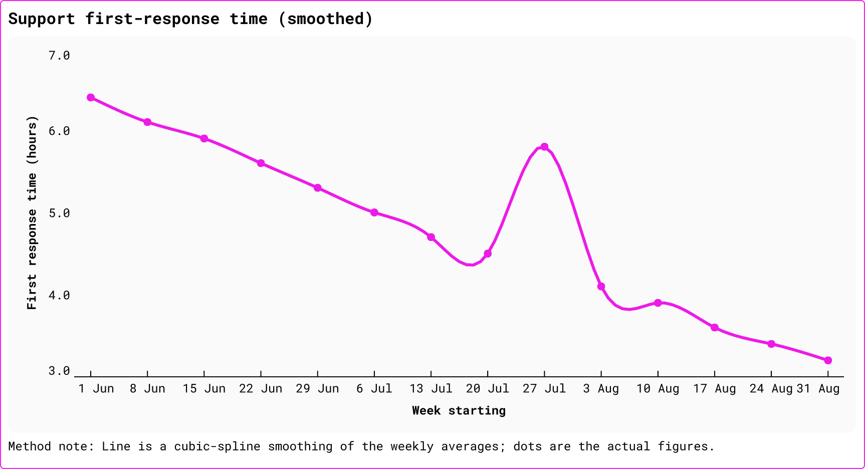
Line chart recipe: Cubic-Spline Smoothing
My data: <select and/or describe your data here>
Use when the series is continuous and a smooth between-point path helps readability. Start with a canvas cell containing date and value; sort by date and retain every observed point.
1. Build the smoothed series
Build a Python output called cubic_spline_series. Convert dates to elapsed days, solve a natural cubic spline (second derivatives = 0 at both endpoints), and evaluate eight evenly spaced positions within each original interval. Output date, smoothed_value, and original_value. Set original_value to NULL on interpolated rows, retaining it only at original observation dates. Sort by date.
2. Build the two-layer chart
- Line: x =
date; y =smoothed_value; fixed colour#ED1AE8; tooltip hidden. - Points: x =
date; y =original_value; circle size 4; fixed colour#ED1AE8. This makes hover show observed values only.
3. Apply the finish
- If using the cubic spline, title the chart
[Metric name] (smoothed)in Roboto Mono. If switching to a raw line, title it[Metric name]. - Axis titles: bold Roboto Mono.
- Gridlines: off (
lines.grid: null). - Place the chart and caption inside one thin 1px
#ED1AE8frame. Remove any separate chart-only outline, and use a minimal gap (about 4px) between the chart and caption. - Date labels: day + short month.
- Value labels/tooltips: number, 1 decimal, thousands separator.
- Cubic-spline caption (only when smoothing is retained):
Method note: Line is a cubic-spline smoothing of the weekly averages; dots are the actual figures.Replace ‘weekly’ with the relevant cadence. If switching to a raw line, adjust this method note accordingly.
4. Size the chart for the data
Choose dimensions from the number and density of plotted dates, the cadence, and rendered label legibility. Keep the chart landscape; if labels or local movement crowd, widen it or use a business-meaningful coarser cadence—never squeeze or scroll the plot.
Guardrail
Natural cubic splines always pass through observed points, but can overshoot around sharp period-on-period swings. If that could materially change interpretation, use a shape-preserving smoother or a raw line instead. When using a raw line, remove all smoothing language and the overshoot caveat; the line and dots are then the exact observed values.
Last updated: 10/09/26